The design process for a novel is difficult enough, spending (literally) dozens of hours unearthing a concept that could work across not only the novel, but the Art Book and Album as well pushed my designer, Mike Cranston, very nearly into a delusional state.
I’m going to do a very big video session on how Mike and I finally landed on what is below, including everything from fonts through to ideas based around sacred geometry and the internal theories of the novel. But, for the mean time, I want to merely present the designs and hear what you think. The reasons will come later.
The images should link through to the high res versions on Flickr, but to skip straight there, click here.
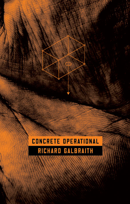
Concrete Operational - The Novel - Front
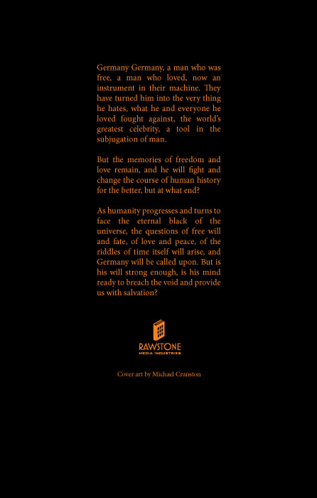
Concrete Operational - The Novel - Back
Concrete Operational - The Art Book - Front
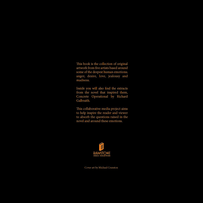
Concrete Opertional - The Art Book - Back
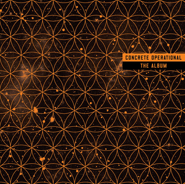
Concrete Operational - The Album - Front
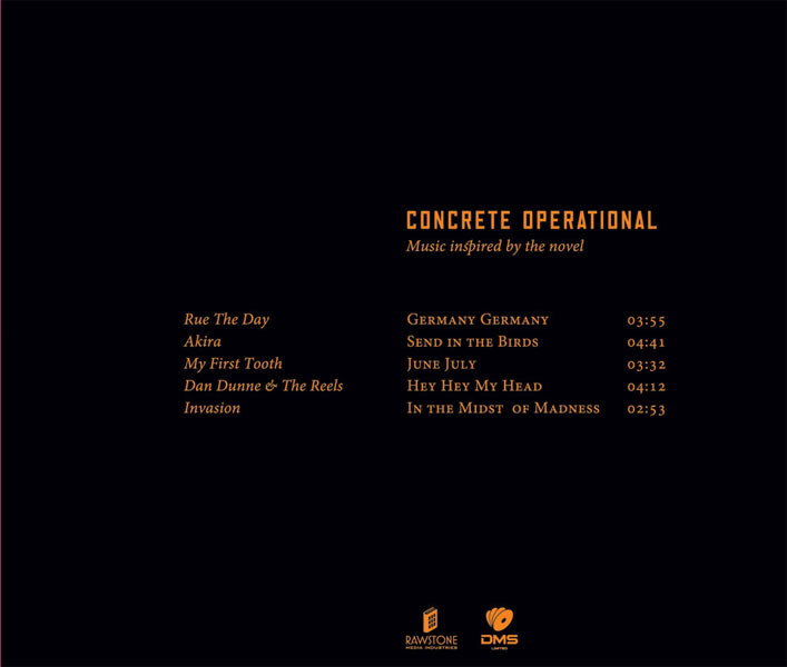
Concrete Operatinoal - The Album - Back
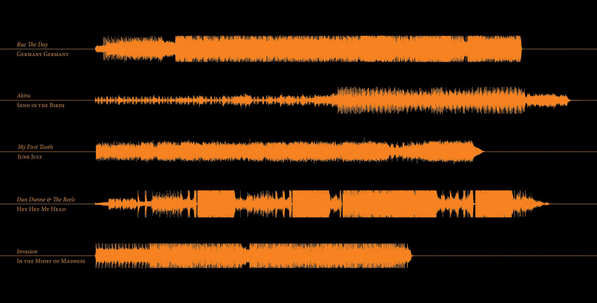
Concrete Operational - The Album - Inlay



One Comment
1 The Rents wrote:
Great cover, the box is very thought provoking, changes as you look at it (or have we had too much wine!). Good continuity throughout the three pieces with bold title and good strong font. Also like the Rawstone Media logo and text.